Case Study for Healthcare Organization
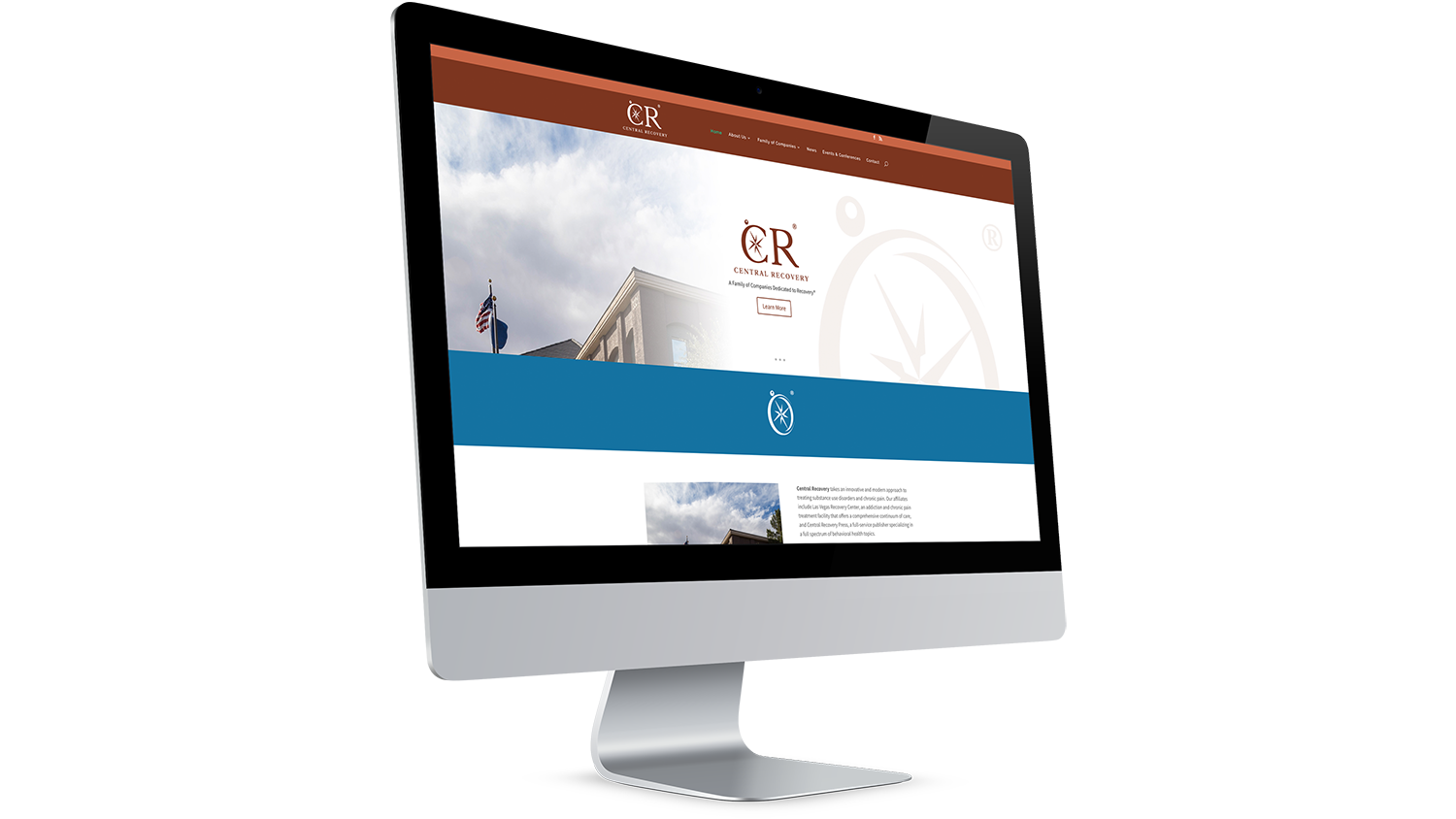
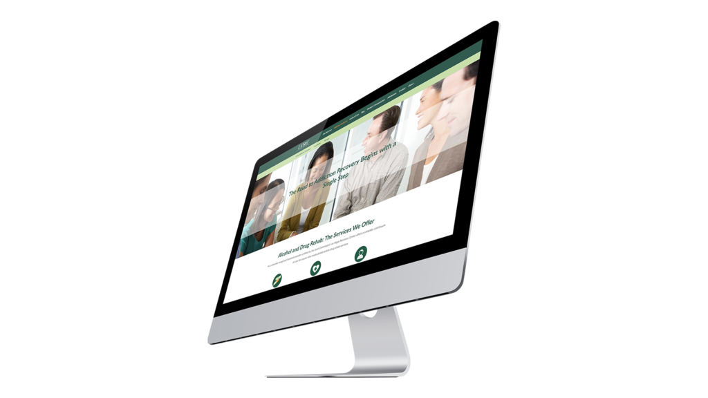
Led brand storytelling, content creation, and website development and management for an addiction and chronic pain treatment center and its family of companies, including a publisher of behavioral health books.
THE WORK
Organization website:
centralrecovery.com
lasvegasrecovery.com
ORGANIZATION STORY
Central Recovery and it’s family of companies, Las Vegas Recovery Center and Central Recovery Press, seek to help people suffering from addiction and chronic pain.
CHALLENGES & GOALS
- New brand and voice needed to be developed to better connect with audience.
- Lacked time and staff resources to produce original content and marketing materials were dated and ineffective
- Low engagement rates on social media
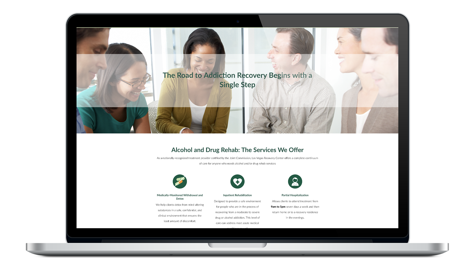
- Websites were outdated, not responsive and difficult for staff to manage
- Internal communication (company newsletter) needed improvement and a better delivery system to better engage employees
THE STRATEGY
- Created first company style guides and a new and refreshed visual brand, and a new voice (messaging)
- Developed and designed responsive websites that were easier to manage to improve bounce rates and engagement
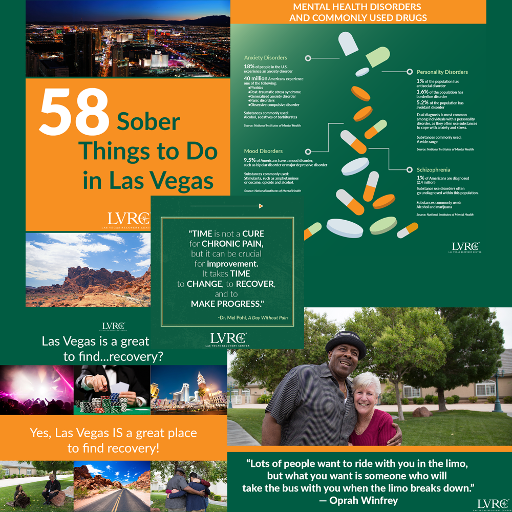
- Developed first video marketing campaigns, implemented a new social media strategy, and developed new digital content a content creation calender
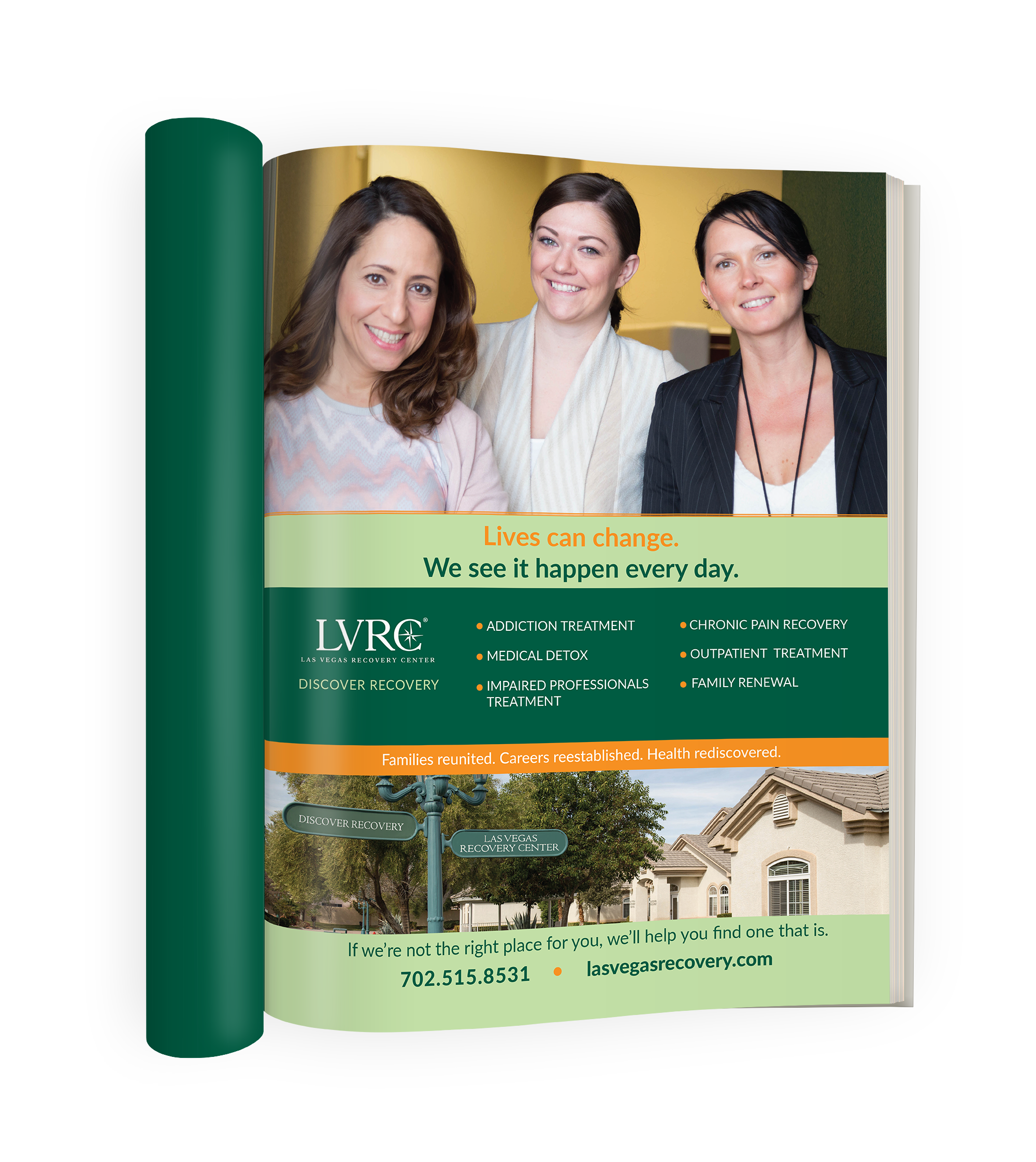
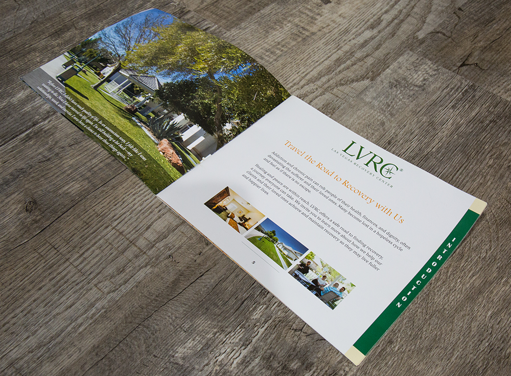
- Redesigned all print and digital marketing materials, such as brochures and infographics
- Implemented new email marketing campaigns, including the internal newsletter (which also went through a redesign) to increase internal employee engagement.
Results
After these new strategies were implemented and the rebrand, the websites got more traffic, bounce rates went down, internal communication improved, and the center received more calls.
%
Increased Social Media Engagement
%
Increased Video Views and Engagement
Visual Branding
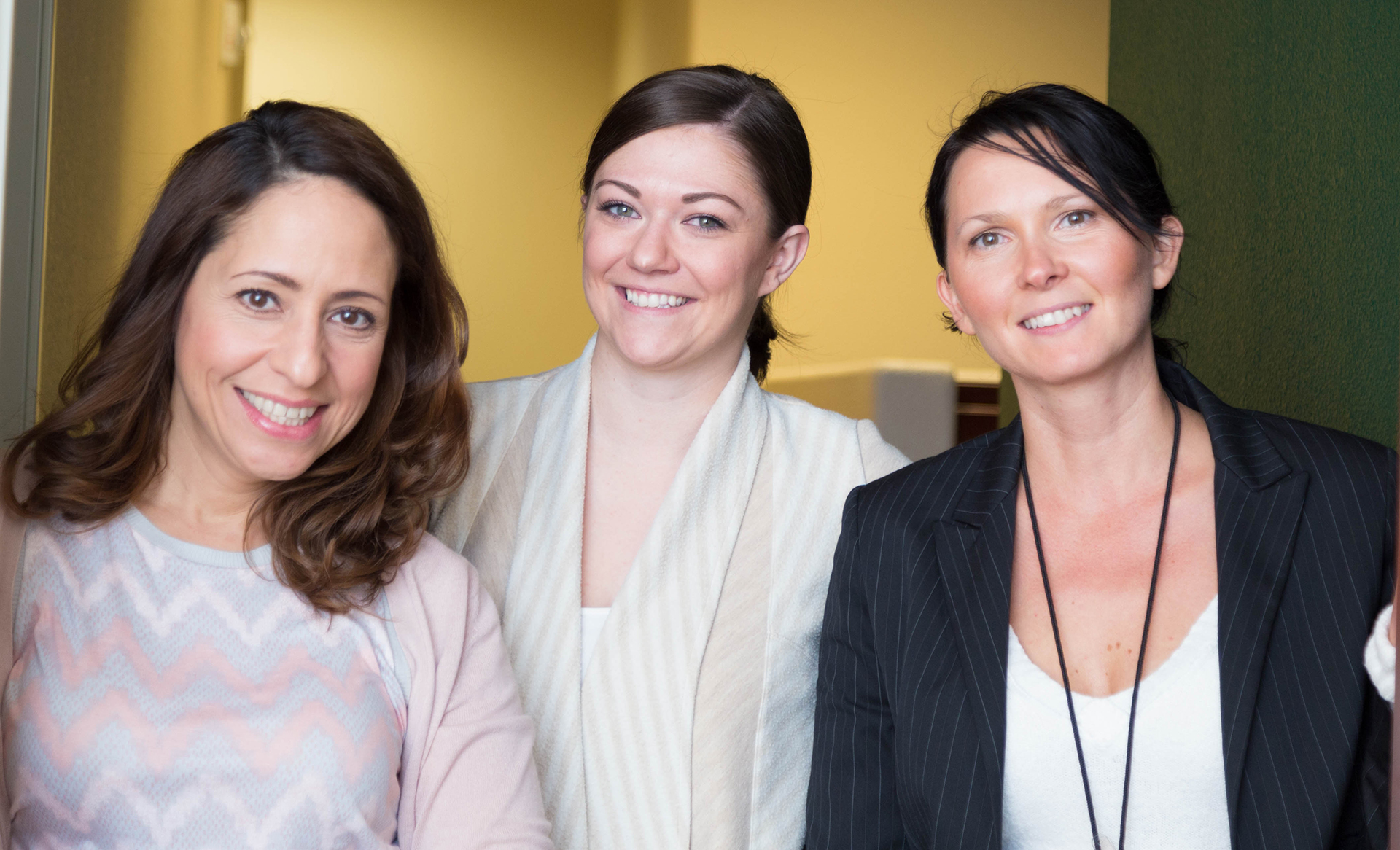
The organization originally only had dark brown (its logo color), dark green, and white primary colors. The color scheme around the dark brown was brightened to create a better balance between stablity/experience and light/healing. This created a more dynamic and welcoming feel. In addition, photography and marketing materials were updated to better communicate this is a safe place to heal.





Aa
Source Sans Pro (heading)
Lato (body)
Video Production & Marketing
Graphics & Imagery
